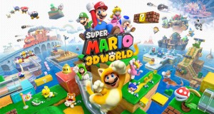
Reviewed on Nintendo Wii Virtual Console.
One of the most welcome additions to all of the current generation consoles is the ability to play older classic titles, whether through backwards compatability or through the online stores: Xbox Marketplace, Wii Shop and Playstation Network. Its a feature that helps gives gaming context and a sense of history as well as welcome opportunity to revisit or discover classic titles no longer available for retail in brick and mortar game stores.
The Wii’s Virtual Console in particular, spanning over 6 different consoles, is invaluable for providing an outlet to experience classic console titles. With the Wii still early into its life cycle, it’s no exaggeration to say that I’ve played more Virtual Console titles than actual new titles for the Wii itself.
Being a ‘Playstation’ kid when I was younger, the two most anticipated titles for me were Super Mario 64 and The Legend of Zelda: Ocarina of Time, two titles that frequently sit atop Greatest Games of All Time lists.
After spending some time with Super Mario 64, I’ve reached a rather sobering conclusion: The game is simply too frustrating and the camera is too clunky for me to enjoy.
In the same way that I find Citizen Kane a dull film but can appreciate the importance of its narrative and technical innovations, I understand that Super Mario 64 essentially created the foundations of the three dimensional platforming genre but several areas of the title have aged poorly and frustrated me to no end.
The chief offender is the camera. The three pronged Nintendo 64 controller is notable for popularizing analogue controls for home consoles. It was Sony’s Dualshock though, that added the second stick on the controller which has since become the industry standard. Having only played 3-d games with dual stick controllers where the right stick would typically control the camera, I found the camera control in Super Mario 64 incredibly annoying. There is no option to assign the right stick so it orbits around Mario as it would with any contemporary platformer.
Due to the struggle I had with the camera, it felt like half of the obstacles Mario has to overcome in the game are a challenge because the game doesn’t help you at all with setting the camera at a suitable angle and not nearly as much to do with the design of the levels themselves.
Secondly, the graphics, as with virtually all other games from the 32/64 bit era, look dreadful when stretched out onto a 42 inch flatscreen televsion. Granted, Super Mario 64 actually looks better than most other titles from that generation due to its cartoony colour palette and minimalist in-game models but it looks rather bland when compared to the art style of its successors Super Mario Sunshine and Super Mario Galaxy or the previous generation’s Super Mario World and Yoshi’s Island. There is even a fondness and certain charm associated with 8-bit Mario pixel art. No one wears shirts adorning first generation 3-D games though. Short of the Gameboy titles, you could argue that Super Mario 64 is possible the ugliest of the plumber’s platforming adventures.
MTV video game blogger Stephen Totillo recently said he wants to see more video game remakes in the mold of Tomb Raider Anniversary where old games are remade with current generation engines but without tampering too much with the core level design or narrative if there is one. To be honest, after playing Super Mario 64 for the first time this year, I’m inclined to agree. I’m sure there’s a great game in there but I couldn’t access it because of the dogged controls. Surely I’m not alone in this?
 The FAT Website est. 1999


