There are a lot of ingredients that have to come together for a film to be truly great. Sometimes a film will come along that blows you away with spectacular visual effects or striking costumes and imagery only to be let down by shoddy characterisation, poor pacing or a clunky script. For every great ‘effects’ movie that comes along, such as Pans Labyrinth, Children of Men or Amelie, where they deliver substance to go with the style, there are others that have a similarly lofty ambitions but don’t quite get there for one reason or another.
I recently went through my DVD collection and rewatched a selection of scenes from the following films. They’re far from being favourites but I think there’s no harm in watching them at least once for their highly polished or unique visual charms. By a strange coincidence, all three films I picked were released in the same year.
The Curse of the Golden Flower (2006)
This film is about an emperor who returns to his kingdom and his wife who he suspects of having an affair with some guy. Meanwhile Other Guy is interested in a princess and Gong Li is all like ‘oh no you di-n’t’. At some point ninjas get involved.
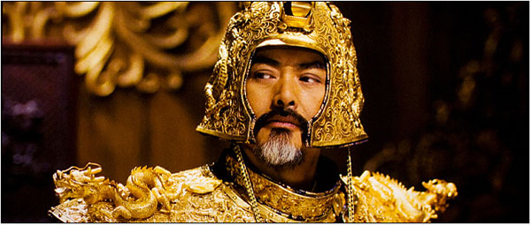
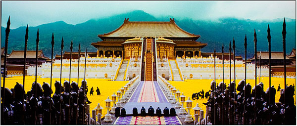
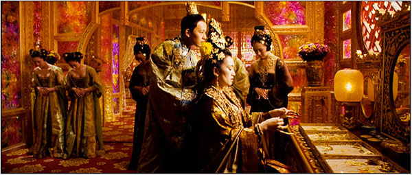
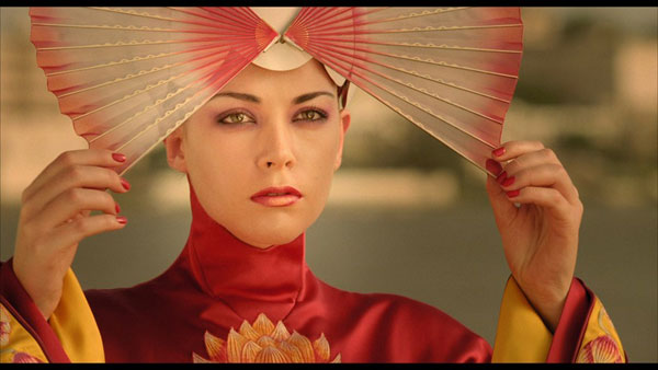
While the story didn’t hold my interest, just look at the range of colour that permeates every single frame of this movie. Each still looks like its been through Photoshop with the contrast cranked up to full. Everyone in this movie chills out in ornate solid gold suits of armour or expensive silk robes like the kind Ric Flair used to wear in the Eighties. It looks amazing.
The Fall (2006)
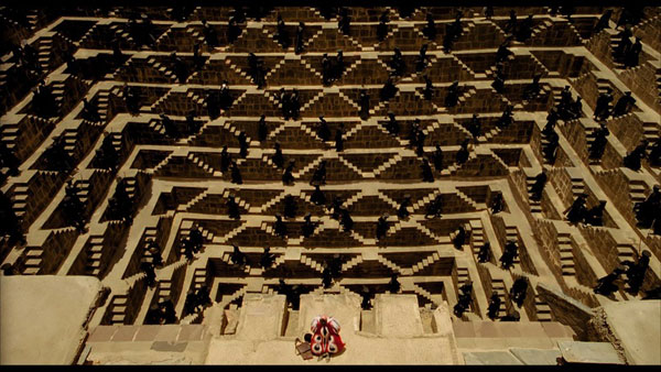
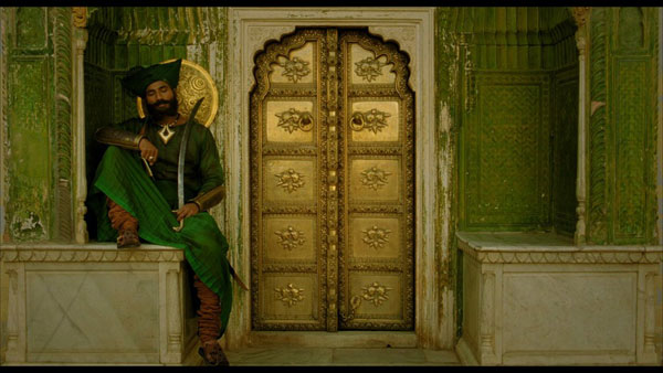
The cool thing about The Fall, a film in which a bed-ridden man narrates a tale to a little girl who sits at his bedside is that all of these fantastic looking scenes were done without the aid of computer effects. Each image is artfully composed and full of patterns and symmetry which are pleasing to the eye. The story isn’t actually too bad here either. I like how the visual representation of the story told by the man is occasionally misinterpreted by the little girl. At one stage, there is confusion when the girl thinks an ‘Indian’ that the man is referring to is a Native American when he actually means someone from the sub-continent region. Once she realises this, the Indian in the story changes to reflect this.
While its not a badly told tale but its not all that memorable either. It doesn’t have the lasting appeal of something like The Never Ending Story and it isn’t up to the level of a Pan’s Labyrinth either. It just looks really nice.
Renaissance (2006)
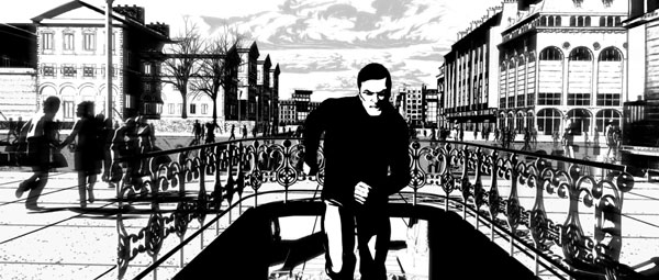
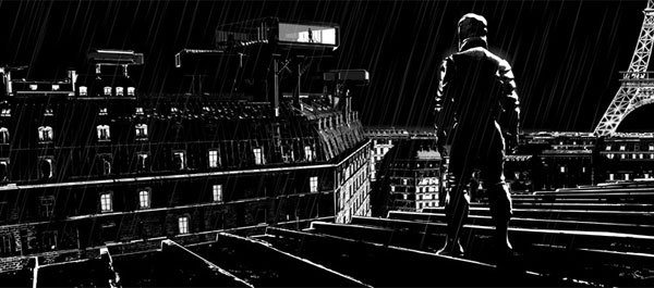
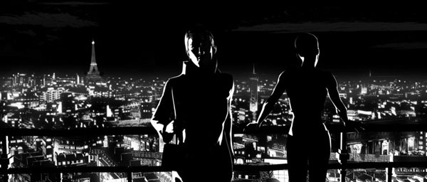
Renaissance is an animated French feature that came out a year after Sin City. This is close to being a literal black and white film. There is only a small amount of grey used to pick up some of the detail.
The story is set in the future and is a generic film noir tale about a missing girl. The English dubbed version is of decent quality and obviously had a bit of money behind it (Daniel Craig and Iain Holm are involved) so don’t feel you need to track down the original French copy with English subs. However, as with The Fall and The Curse of the Golden Flower, you won’t remember the story at all in a few months, just the nifty black and white visuals.
 The FAT Website est. 1999



The Fall really struck a chord with me. i thoroughly enjoyed that film.
The other two i haven’t seen though, will have to maybe check them out =p
I think of the other two, you’re more likely to enjoy Renaissance.
The Curse of the Golden Flower is pretty boring :/